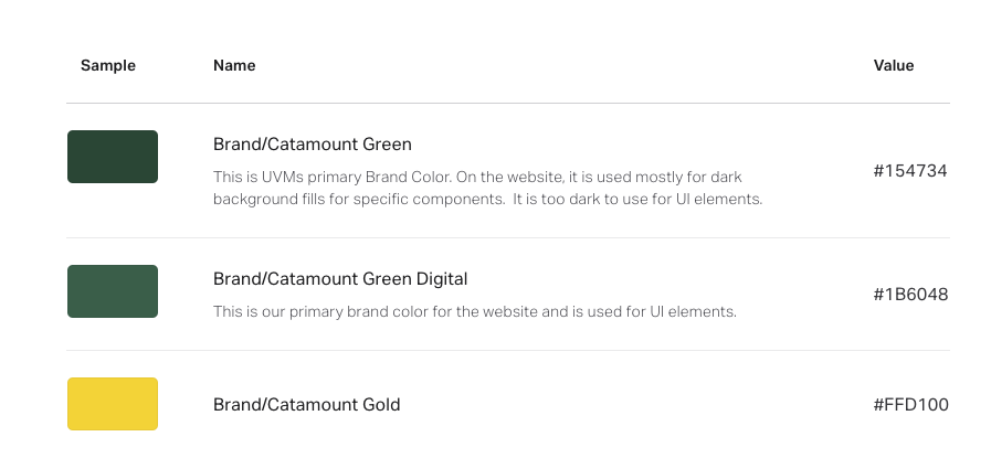
Our primary color palette is designed for use throughout our digital products within interfaces and for branding. The primary brand dark (Catamount Green) and primaryLight (Catamount Gold) are displayed most frequently across our products’ screens and components.
Primary colors are used for:
- Dark background fills
- Key actions such as primary call to action buttons
- Highlighted content
Component guidelines indicate how colors should be applied, noting where some should be utilized sparingly and with purpose for specific components like errors UI interface elements and background fields.
Primary
Grayscale
darkGray: #26292C
lightGray: #5D646B
neutral: #F7F7F7
White: #FFF
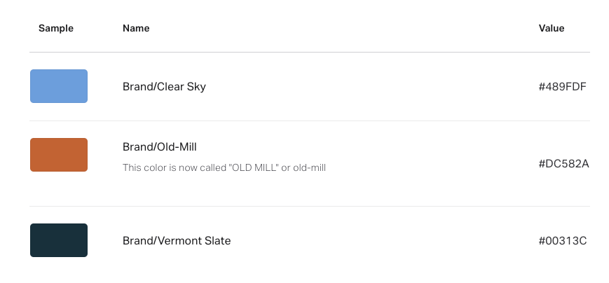
Brand Accent
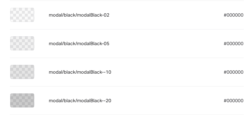
Modals